
There are a lot of useful tools out there that can help you see trends and patterns in your data… but how valuable is that in the real world? Recently, I have been looking into Matplotlib and Seaborn - two of Python’s best data visualisation libraries. With the knowledge of these packages (and a few other data science dependencies), you can begin to really see, for example, the likelihood of your survival on the Titanic…
Initialisation
If we want to work with these third-party data visualisation libraries, we first need to first install them from command prompt/the terminal. This can be done using pip, the Package Installer for Python. Pip is bundled with most modern distributions of Python since about 3.4+.
After installing the package manager, individual libraries can be installed from your command line/terminal as so (just substitute {package name} for the name of the library):
pip install {package name}import numpy as np
import pandas as pd
import matplotlib.pylplot as plt
%matplotlib inline
import seaborn as sns
A brief intro to the libraries
Seaborn is the main library I will be demonstrating here. It builds off the power of Matplotlib, and while they both have charting capabilities, it is incredible the amount that you can do with a single line in Seaborn.
Pandas gives the ability to create what is known as a Pandas Dataframe. These can be thought of as Excel-like worksheets, with methods to select/filter on rows and columns by criteria. Numpy is a dependency, mainly used to create data arrays - it is not used raw in this blog.
For the sake of demonstration and ease, Seaborn offers various datasets. Provided you have an internet connection, you can query what sets are available like so:
sns.get_dataset_names()Loading the Data
One of these datasets is about the Titanic. Loading this in, we can also get a snippet of the first few rows to get an idea of what the data looks like:
titanic = sns.load_dataset('titanic')
titanic.head()| Survived | pclass | Sex | Age | sibsp | parch | fare | embarked | Class | who | adult_male | deck | embark_town | alive | alone | |
|---|---|---|---|---|---|---|---|---|---|---|---|---|---|---|---|
| 0 | 0 | 3 | M | 22 | 1 | 0 | 7.2500 | S | Third | Man | True | NaN | Southampton | N | False |
| 1 | 1 | 1 | F | 38 | 1 | 0 | 71.2833 | C | First | Women | False | C | Cherbourg | Y | False |
| 2 | 1 | 3 | F | 26 | 0 | 0 | 7.9250 | S | Third | Women | False | NaN | Southampton | Y | True |
| 3 | 1 | 1 | F | 35 | 1 | 0 | 53.1000 | S | First | Women | False | C | Southampton | Y | False |
| 4 | 0 | 3 | M | 35 | 0 | 0 | 8.0500 | S | Third | Man | True | NaN | Southampton | N | True |
Simple data visualisation
If we have simple categorical data- sex, embarked, or even sibsp (number of siblings/spouses)- we can use Pandas methods to aggregate these, and perform a count:
# Count values according to Siblings/Spouses
 titanic['sibsp'].value_counts()
0 608
1 209
2 28
4 18
3 16
8 7
5 5
Name: sibsp, dtype: int64
All this is fine if we are only looking to gather values. To really see the data it helps to graph it.
sns.countplot(x='sibsp', data=titanic)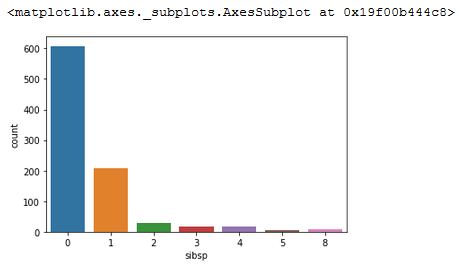
This is a very simple example showing the count of each distinct item. We are not really gaining any insight we do not already know.
We can also do things like scatter plots of bi-variate data, i.e. age vs fare:
sns.scatterplot(x='age', y='fare', data=titanic)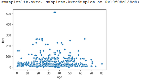
And add a line of regression to see the correlation:
sns.lmplot(x='age', y='fare', data=titanic, line_kws={'color':'red'})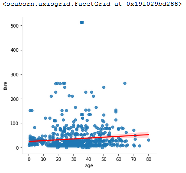
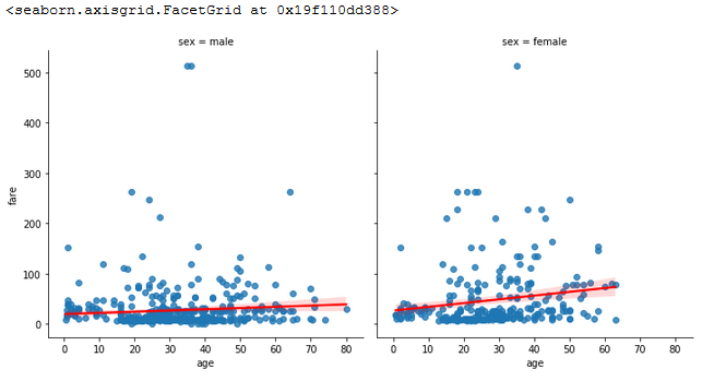
All these graphs shown before can be extended to show multi-dimensional data.
sns.lmplot(x='age',
           y='fare',
           data=titanic,
           line_kws={'color':'red'},
           col='sex'
          )
So… how does this help you survive the Titanic?
Money?
My first thought, is there any correlation between those who paid more for their tickets, and those who survived?
sns.boxplot(x='survived', y='fare', data=titanic)
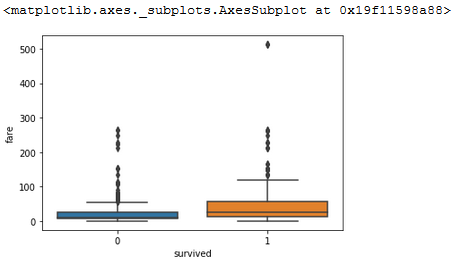
Interpreting these box plots, it would appear that those who paid a significant amount (500+) did survive, but this could have been coincidence. If we forgive this outlier, and zoom more into the real data:
plt.figure(figsize=(7,7))
 sns.boxplot(x='survived',y='fare',data=titanic, showfliers = False)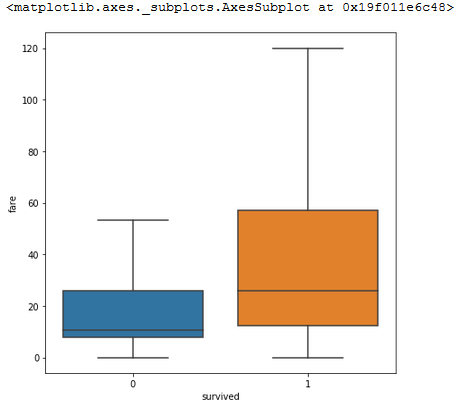
Zooming in on this, it is immediately a lot easier to see that those who paid more, were better looked after.
Gender?
sns.countplot(x='survived',data=titanic, hue='sex')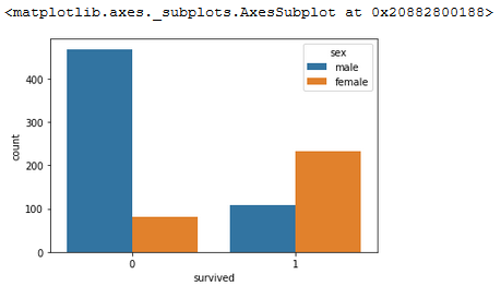
A quick look at gender survival rates shows that being a male is not in your favour. It should be noted that there are more males in the data set, but you can see by comparing the heights of the bars that only about 1/6 of the males survived, while 2/3 of the females survived.
Family?
So, we have established that money and gender are good indicators. But what about the children? Plots using Matplotlib are better for advanced visualisations such as these.
died = titanic[titanic['survived']==False]['parch'].value_counts().sort_index()
 totals = titanic['parch'].value_counts().sort_index()
 dead_pct = (100*died/totals).fillna(0)
 fig = plt.figure()
 ax = fig.add_axes([0,0,1,1])
 ax.plot(dead_pct, color='red')
 ax.set_xlabel('Number of parents/children in party')
 ax.set_ylabel('Mortality %')
 ax.set_title('Family size by Mortality% on the Titanic')
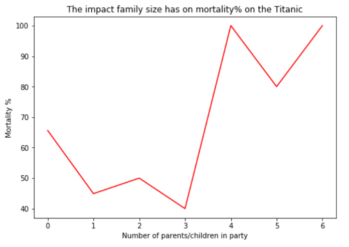
In situations where there were larger families (4+), there was a lesser rate of survival, good argument for smaller family units! Or maybe it is even better to travel alone?
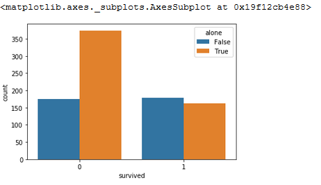
Actually, very much the opposite. It would appear that those passangers traveling alone were almost twice as likely not to make it out than those with others.
Conclusion
I think if I had to make a recommendation based on the data I’ve studied thus far, it’d be don’t buy a ticket for Titanic. If you were going to do it anyway, take some family, maybe treat a couple of nieces or nephews, and consider paying that little bit extra for the upgrades. Life may be shorter than you think…
Of course, all of this is based off my interpretation of a couple of graphs. This is a great way to scratch the surface of what we can learn from this data, but to really get to grips with it, and begin to make accurate predictions, we can consider training our systems using a method known as machine learning. More on this next time.
Resources
- Anaconda - www.anaconda.com
- Pip - pypi.org/project/pip
- Seaborn - seaborn.pydata.org
- Matplotlib - matplotlib.org
- Pandas - pandas.pydata.org
- Numpy - numpy.org
- Titanic Dataset - www.kaggle.com/c/titanic/data
- Awesome Public Datasets - github.com/awesomedata/awesome-public-datasets

APL Team Leader
James is an APL Programmer with a keen interest in mathematics. His love for computing was almost an accident. From a young age he always enjoyed using them- playing video games and such- but it was never considered that anything more would come from it. James originally had plans to pursue a career in finance. More about James.
Ask James about APL / APL Consultancy / APL Legacy System Support
- How I’m Keeping My Social Life Going During Lockdown
- Home user guide modems and routers
- DisplayPort no signal – How to fix this issue in Windows 10
- How to stop Windows 10 automatic upgrades
- Using a MIDI Controller With Dyalog APL
- How to Delete Your Social Media Profiles – and Why You Probably Should
- Pervasion of Ambivalence in APL Functions